
이제 본격적으로 만들어볼겁니다.
우선 홈페이지 UI제작을 할겁니다. 네브바를 만들기 위해 layout.tsx로 갑니다.
그리고 각각의 div를 만들어줄겁니다.
import { Outlet } from "react-router-dom";
import styled from "styled-components";

const Wrapper = styled.div``;

const Menu = styled.div``;

const MenuItem = styled.div``;

export default function Layout(){
    return (
        <Wrapper>
          <Menu>
            <MenuItem>
            </MenuItem>

            <MenuItem>
            </MenuItem>

            <MenuItem>
            </MenuItem>
          </Menu>
          <Outlet />
        </Wrapper>
    );
}이렇게 나눠주고 이제 각 MenuItem에는 각각 홈버튼, 프로필 버튼, 로그아웃 버튼을 만들겁니다.
아이콘을 가져오기위해 heroicons.dev 로 접속하고 각각에 어울리는 icon을 복사 붙여넣기 할겁니다.
이때 STRICT JSX를 선택하고 COPY 해서 오시면됩니다.
이제 각각의 아이콘에 Link를 걸어야합니다.
홈버튼은 to="/", 프로필은 to="/profile"으로 보내면 되겠네요. 로그아웃은 필요가 없습니다.
이제 각 div에 css를 적용할겁니다.
const Wrapper = styled.div`
  display: grid;
  gap: 20px;
  grid-template-columns: 1fr 4fr;
  padding: 50px 0px;
  height: 100%;
  width: 100%;
  max-width: 860px;
`;

const Menu = styled.div`
  display: flex;
  flex-direction: column;
  align-items: center;
  gap: 20px;
`;

const MenuItem = styled.div`
  cursor: pointer;
  display: flex;
  align-items: center;
  justify-content: center;
  border: 2px solid white;
  height: 50px;
  width: 50px;
  border-radius: 50%;
  svg {
    width: 30px;
    fill: white;
  }
  &.log-out {
    border-color: tomato;
    svg {
      color: tomato;
    }
  }
`;logout쪽 MenuItem에는 className="log-out"을 사용해서 조금 다른 css를 적용해줍니다.
이제 로그아웃 로직을 작성할겁니다.
사용자를 로그아웃 시키고 login 화면으로 안내해야합니다.
export default function Layout() {
  const navigate = useNavigate();
  const onLogOut = async () => {
    const ok = confirm("로그아웃 하시겠습니까?");
    if (ok) {
      await auth.signOut();
      navigate("/login");
    }
  }
-------------------------------------생략-----------------------------------
        <MenuItem onClick={onLogOut} className="log-out">

}이동에는 useNavigate를 사용하고 async await를 사용하고 로그아웃 전에 확인절차를 하나 만들어둡니다.
로그아웃쪽 MenuItem에는 onClick 이벤트를 넣어서 적용해줍니다.
트윗페이지를 제작하기 위해서 components 밑으로 post-tweet-form.tsx를 만들어줍니다.
import styled from "styled-components"

const Form = styled.form``;

const TextArea = styled.textarea``;

const AttachFileButton = styled.label``;

const AttachFileInput = styled.input``;

const SubmitBtn = styled.input``;

export default function PostTweetFrom() {
    return (
        <Form>
            <TextArea placeholder="What is happening" />
                <AttachFileButton htmlFor="file">Add photo</AttachFileButton>
                <AttachFileInput type="file" id="file" accept="image/*" />
                <SubmitBtn />
        </Form>
    )
}코드를 채워줍니다.
<AttachFileInput type="file" id="file" accept="image/*" /> 부분에서는 이미지는 어떠한 확장자라도 받을 수 있게 image/* 로 작성합니다.
home.tsx로 이동해서 PostTweetForm을 가져올겁니다.
import styled from "styled-components";
import PostTweetFrom from "../components/post-tweet-form";

const Wrapper = styled.div``;

export default function Home() {
    return (
        <Wrapper>
          <PostTweetFrom />
        </Wrapper>
    );
}그리고 확인해보면
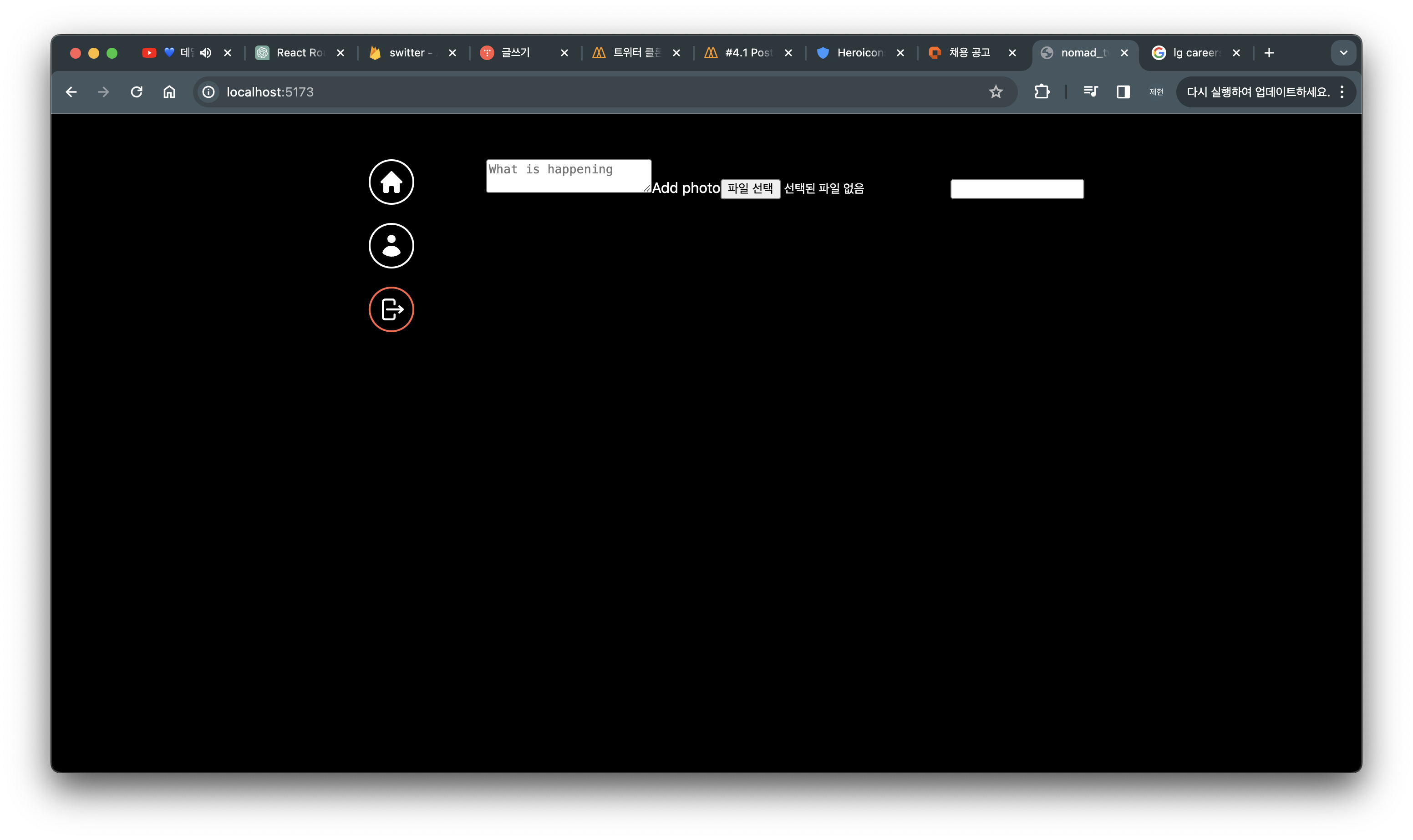
폼이 완성되어 있습니다.
여기서 Add photo 를 클릭하면 파일 선택과 같은 동작을 하는것을 볼 수 있습니다. input 버튼을 꾸미는건 까다롭기 때문에
display: none; 으로 지워줍니다.
submitBtn도 타입을 submit로 지정하고 value로 버튼에 나타낼 텍스트를 정해줍니다.
<SubmitBtn type="submit" value="Post Tweet" />이제 css를 좀 만질겁니다.
const Form = styled.form`
    display: flex;
    flex-direction: column;
    gap: 10px;
`;

const TextArea = styled.textarea`
    border: 2px solid white;
    padding: 20px;
    border-radius: 20px;
    font-size: 16px;
    color: white;
    background-color: black;
    width: 100%;
    resize: none;
    font-family: system-ui, -apple-system, BlinkMacSystemFont, 'Segoe UI', Roboto, Oxygen, Ubuntu, Cantarell, 'Open Sans', 'Helvetica Neue', sans-serif;
    &::placeholder{
        font-size: 16px;
    }
    &:focus {
        outline: none;
        border-color: #1d9bf0;
    }
`;

const AttachFileButton = styled.label`
    padding: 10px 0px;
    color: #1d9bf0;
    text-align: center;
    border-radius: 20px;
    border: 1px  solid #1d9bf0;
    font-size: 14px;
    font-weight: 600;
    cursor: pointer;
`;

const AttachFileInput = styled.input`
    display: none;
`;

const SubmitBtn = styled.input`
    background-color: #1d9bf0;
    color: white;
    border: none;
    padding: 10px 0px;
    border-radius: 20px;
    font-size: 16px;
    cursor: pointer;
    &:hover,
    & active{
        opacity: 0.8;
    }
`;뚝딱뚝딱 하면 대충 각이 잡힌 폼이 완성됩니다.
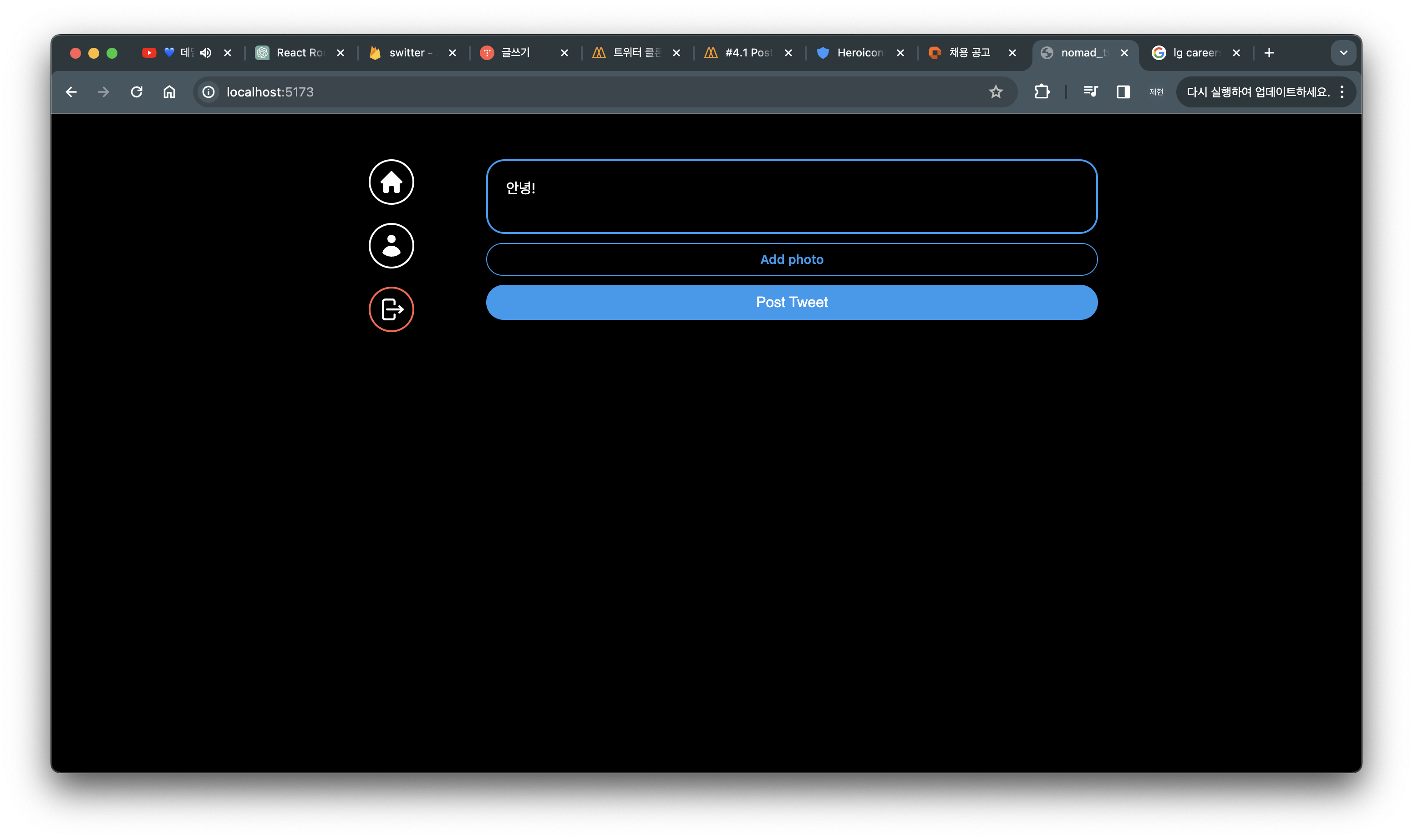
이제 사진을 추가했을때 버튼의 텍스트가 달라지게 만들겁니다.
export default function PostTweetFrom() {
    const [isLoading, setLoading] = useState(false);
    const [tweet, setTweet] = useState("");
    const [file, setFile] = useState<File | null>(null);
    const onChange = (e: React.ChangeEvent<HTMLTextAreaElement>) => {
        setTweet(e.target.value);
    }
    const onFileChange = (e: React.ChangeEvent<HTMLInputElement>) => {
        const { files } = e.target;
        if (files && files.length === 1) {
            setFile(files[0]);
        }
    }
    return (
        <Form>
            <TextArea rows={5} maxLength={200} placeholder="What is happening" />
                <AttachFileButton htmlFor="file">{file ? "Photo added✅":"Add photo"}</AttachFileButton>
                <AttachFileInput onChange={onFileChange} type="file" id="file" accept="image/*" />
                <SubmitBtn type="submit" value="Post Tweet" />
        </Form>
    )
}
onChangeFile의 로직을 살펴보면 files에 배열이 있는지 확인하고 그 길이가 1이라면 첫번째 파일을 가져와서 저장해줍니다.
여러개의 input방지를 위해 이렇게 작성해줍니다.
<AttachFileButton htmlFor="file">{file ? "Photo added✅":"Add photo"}</AttachFileButton>
이부분에서 삼항연산자를 사용해서 file이 추가되었다면 추가된 표시를 아니라면 Add photo로 나둡니다.
게시글 작성도 200자 이하로 작성하도록 해줍니다.
'Front-end > twitter_clone' 카테고리의 다른 글
| [트위터 클론코딩 챌랜지] 게시물 쿼리로 받아오기_14 (0) | 2024.04.04 |
|---|---|
| [트위터 클론코딩 챌랜지] firestorage활용 게시글 저장_13 (0) | 2024.04.03 |
| [트위터 클론코딩 챌랜지] 소셜 로그인 구현_11 (0) | 2024.04.02 |
| [트위터 클론코딩 챌랜지] error 표시와 로그인 화면 구성_10 (0) | 2024.04.02 |
| [트위터 클론코딩 챌랜지] 로그아웃_09 (0) | 2024.04.02 |
이제 본격적으로 만들어볼겁니다.
우선 홈페이지 UI제작을 할겁니다. 네브바를 만들기 위해 layout.tsx로 갑니다.
그리고 각각의 div를 만들어줄겁니다.
import { Outlet } from "react-router-dom";
import styled from "styled-components";

const Wrapper = styled.div``;

const Menu = styled.div``;

const MenuItem = styled.div``;

export default function Layout(){
    return (
        <Wrapper>
          <Menu>
            <MenuItem>
            </MenuItem>

            <MenuItem>
            </MenuItem>

            <MenuItem>
            </MenuItem>
          </Menu>
          <Outlet />
        </Wrapper>
    );
}
이렇게 나눠주고 이제 각 MenuItem에는 각각 홈버튼, 프로필 버튼, 로그아웃 버튼을 만들겁니다.
아이콘을 가져오기위해 heroicons.dev 로 접속하고 각각에 어울리는 icon을 복사 붙여넣기 할겁니다.
이때 STRICT JSX를 선택하고 COPY 해서 오시면됩니다.
이제 각각의 아이콘에 Link를 걸어야합니다.
홈버튼은 to="/", 프로필은 to="/profile"으로 보내면 되겠네요. 로그아웃은 필요가 없습니다.
이제 각 div에 css를 적용할겁니다.
const Wrapper = styled.div`
  display: grid;
  gap: 20px;
  grid-template-columns: 1fr 4fr;
  padding: 50px 0px;
  height: 100%;
  width: 100%;
  max-width: 860px;
`;

const Menu = styled.div`
  display: flex;
  flex-direction: column;
  align-items: center;
  gap: 20px;
`;

const MenuItem = styled.div`
  cursor: pointer;
  display: flex;
  align-items: center;
  justify-content: center;
  border: 2px solid white;
  height: 50px;
  width: 50px;
  border-radius: 50%;
  svg {
    width: 30px;
    fill: white;
  }
  &.log-out {
    border-color: tomato;
    svg {
      color: tomato;
    }
  }
`;
logout쪽 MenuItem에는 className="log-out"을 사용해서 조금 다른 css를 적용해줍니다.
이제 로그아웃 로직을 작성할겁니다.
사용자를 로그아웃 시키고 login 화면으로 안내해야합니다.
export default function Layout() {
  const navigate = useNavigate();
  const onLogOut = async () => {
    const ok = confirm("로그아웃 하시겠습니까?");
    if (ok) {
      await auth.signOut();
      navigate("/login");
    }
  }
-------------------------------------생략-----------------------------------
        <MenuItem onClick={onLogOut} className="log-out">

}
이동에는 useNavigate를 사용하고 async await를 사용하고 로그아웃 전에 확인절차를 하나 만들어둡니다.
로그아웃쪽 MenuItem에는 onClick 이벤트를 넣어서 적용해줍니다.
트윗페이지를 제작하기 위해서 components 밑으로 post-tweet-form.tsx를 만들어줍니다.
import styled from "styled-components"

const Form = styled.form``;

const TextArea = styled.textarea``;

const AttachFileButton = styled.label``;

const AttachFileInput = styled.input``;

const SubmitBtn = styled.input``;

export default function PostTweetFrom() {
    return (
        <Form>
            <TextArea placeholder="What is happening" />
                <AttachFileButton htmlFor="file">Add photo</AttachFileButton>
                <AttachFileInput type="file" id="file" accept="image/*" />
                <SubmitBtn />
        </Form>
    )
}
코드를 채워줍니다.
<AttachFileInput type="file" id="file" accept="image/*" /> 부분에서는 이미지는 어떠한 확장자라도 받을 수 있게 image/* 로 작성합니다.
home.tsx로 이동해서 PostTweetForm을 가져올겁니다.
import styled from "styled-components";
import PostTweetFrom from "../components/post-tweet-form";

const Wrapper = styled.div``;

export default function Home() {
    return (
        <Wrapper>
          <PostTweetFrom />
        </Wrapper>
    );
}
그리고 확인해보면
폼이 완성되어 있습니다.
여기서 Add photo 를 클릭하면 파일 선택과 같은 동작을 하는것을 볼 수 있습니다. input 버튼을 꾸미는건 까다롭기 때문에
display: none; 으로 지워줍니다.
submitBtn도 타입을 submit로 지정하고 value로 버튼에 나타낼 텍스트를 정해줍니다.
<SubmitBtn type="submit" value="Post Tweet" />이제 css를 좀 만질겁니다.
const Form = styled.form`
    display: flex;
    flex-direction: column;
    gap: 10px;
`;

const TextArea = styled.textarea`
    border: 2px solid white;
    padding: 20px;
    border-radius: 20px;
    font-size: 16px;
    color: white;
    background-color: black;
    width: 100%;
    resize: none;
    font-family: system-ui, -apple-system, BlinkMacSystemFont, 'Segoe UI', Roboto, Oxygen, Ubuntu, Cantarell, 'Open Sans', 'Helvetica Neue', sans-serif;
    &::placeholder{
        font-size: 16px;
    }
    &:focus {
        outline: none;
        border-color: #1d9bf0;
    }
`;

const AttachFileButton = styled.label`
    padding: 10px 0px;
    color: #1d9bf0;
    text-align: center;
    border-radius: 20px;
    border: 1px  solid #1d9bf0;
    font-size: 14px;
    font-weight: 600;
    cursor: pointer;
`;

const AttachFileInput = styled.input`
    display: none;
`;

const SubmitBtn = styled.input`
    background-color: #1d9bf0;
    color: white;
    border: none;
    padding: 10px 0px;
    border-radius: 20px;
    font-size: 16px;
    cursor: pointer;
    &:hover,
    & active{
        opacity: 0.8;
    }
`;
뚝딱뚝딱 하면 대충 각이 잡힌 폼이 완성됩니다.
이제 사진을 추가했을때 버튼의 텍스트가 달라지게 만들겁니다.
export default function PostTweetFrom() {
    const [isLoading, setLoading] = useState(false);
    const [tweet, setTweet] = useState("");
    const [file, setFile] = useState<File | null>(null);
    const onChange = (e: React.ChangeEvent<HTMLTextAreaElement>) => {
        setTweet(e.target.value);
    }
    const onFileChange = (e: React.ChangeEvent<HTMLInputElement>) => {
        const { files } = e.target;
        if (files && files.length === 1) {
            setFile(files[0]);
        }
    }
    return (
        <Form>
            <TextArea rows={5} maxLength={200} placeholder="What is happening" />
                <AttachFileButton htmlFor="file">{file ? "Photo added✅":"Add photo"}</AttachFileButton>
                <AttachFileInput onChange={onFileChange} type="file" id="file" accept="image/*" />
                <SubmitBtn type="submit" value="Post Tweet" />
        </Form>
    )
}
onChangeFile의 로직을 살펴보면 files에 배열이 있는지 확인하고 그 길이가 1이라면 첫번째 파일을 가져와서 저장해줍니다.
여러개의 input방지를 위해 이렇게 작성해줍니다.
<AttachFileButton htmlFor="file">{file ? "Photo added✅":"Add photo"}</AttachFileButton>
이부분에서 삼항연산자를 사용해서 file이 추가되었다면 추가된 표시를 아니라면 Add photo로 나둡니다.
게시글 작성도 200자 이하로 작성하도록 해줍니다.
'Front-end > twitter_clone' 카테고리의 다른 글
| [트위터 클론코딩 챌랜지] 게시물 쿼리로 받아오기_14 (0) | 2024.04.04 |
|---|---|
| [트위터 클론코딩 챌랜지] firestorage활용 게시글 저장_13 (0) | 2024.04.03 |
| [트위터 클론코딩 챌랜지] 소셜 로그인 구현_11 (0) | 2024.04.02 |
| [트위터 클론코딩 챌랜지] error 표시와 로그인 화면 구성_10 (0) | 2024.04.02 |
| [트위터 클론코딩 챌랜지] 로그아웃_09 (0) | 2024.04.02 |